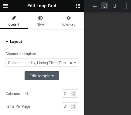
The Loop Grid widget in Elementor allows you to set the total number of columns to display for each breakpoint.
It also allows you to set the total number of items to load and display in the Loop Grid. However, unlike the setting for the number of columns, you cannot customize this for each breakpoint. The Loop Grid widget lets you stick with the same total number of Loop Grid items regardless of the user’s screen size.
This is a limitation if you want to display a different number of items based on the screen size. Take this example:
- Desktop: You want to show 8 items in 2 rows.
- Tablet: You want to show 2 items in 1 row.
- Mobile: You want to show 3 items in 1 row.
Fortunately, we can use Custom CSS to conditionally hide items than exceed our desired number of total items for a certain breakpoint.
However, remember that this will not work with pagination. If you need pagination and cannot do custom PHP code, you might be better off adding separate Loop Grids with different settings, and then using Responsive settings to set whether one Loop Grid should be displayed or hidden.
Add Custom CSS
For the custom CSS, I recommend that you use descriptive and generic utility CSS classes that perform just exactly one purpose.
Here is an example. If you want to display 3 items in the Desktop and Mobile breakpoints, but only 2 in the Tablet breakpoint, you can do this:
- Set the total number of Loop Grid items to 3.
- Define the CSS class “loop-grid-item-hide-3-up-in-tablet” to detect when the screen is within the Tablet breakpoint, and then hide items 3, 4, and up.
- Add this CSS class to the Loop Grid.
Assuming that your Tablet breakpoint is 481px to 834px, this would be your CSS:
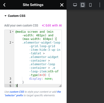
@media screen and (min-width: 481px) and (max-width: 834px) {
  .elementor-widget-loop-grid.loop-grid-item-hide-3-up-in-tablet > .elementor-widget-container > .elementor-loop-container > .e-loop-item:nth-of-type(n+3) {
    display: none;
  }
}
You might wonder about nth-of-type selector which is used in the CSS above. Use this instead of nth-child if you want to have the same behavior in the live website and in the Elementor editor. This is because Elementor adds a STYLE tag as the first child element of the wrapper of all Loop Grid items, but only in the live website not the Elementor editor. You can read this article for more information about the difference between the two CSS selectors.
When you are done, go to Site Settings > Custom CSS and append and save the custom CSS.
Update the Loop Grid
- For each breakpoint, configure the number of columns for the Loop Grid widget.
- Set the number of Loop Grid items to the highest number of items you want to display among all the breakpoints. All of these items will be loaded by the Loop Grid widget, but we will hide some items conditionally depending on the current screen size.
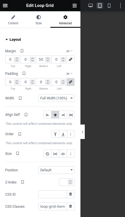
- Go to the Advanced tab for the Loop Grid, and then look for “CSS Classes” under “Layout”. Set the CSS class for the Loop Grid to the CSS class that you used in the custom CSS. The CSS class should not have the leading dot (“.”).