When creating a page, always remember this:
DESKTOP ➤ TABLET ➤ MOBILE
Responsive attributes you set for Desktop will reflect on Desktop, Tablet, and Mobile, attributes for Tablet will reflect on Tablet and Mobile, and attributes for Mobile will reflect only on Mobile.
However, there are attributes that apply to all screen sizes, such as:
- Column content width (boxed / full width)
- Text margins
- Widget margins
- Padding
Changes to these attributes will reflect on Desktop, Tablet, and Mobile.
Testing the Live Website in Different Screen Sizes
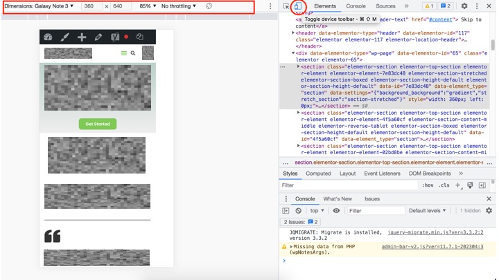
After making changes to the page design, always check if the live website renders correctly in all screen sizes that you want to support. Right-click on the live website in your browser, select “Inspect”, and then click on the “Responsive” icon encircled in the image below. You can test the live website in different screen sizes, but remember to always test with the standard / recommended breakpoints.

Checking and updating the page responsiveness can be repetitive and tedious. If the live website does not render well in some screen sizes, go back to the Elementor page editor and make the necessary adjustments.
Inconsistencies Between the Elementor Page Editor and the Live Website
You may encounter inconsistencies between the live website and the Elementor page editor. This means that your design might look correct in the editor but will be broken in the live website, whether in the Tablet and Mobile view. It might also be the other way around: the design might render well in the live website but will broken on the editor for Tablet and Mobile views.
To fix this issue, you can try these options:
- Purge all caches in the WordPress admin top bar
- Clear caches in your web browser
- Refresh the live website
- Refresh the Elementor page editor
Additional Resources
You can view the tutorial videos below to learn more.
